Kuba Boba

Goal
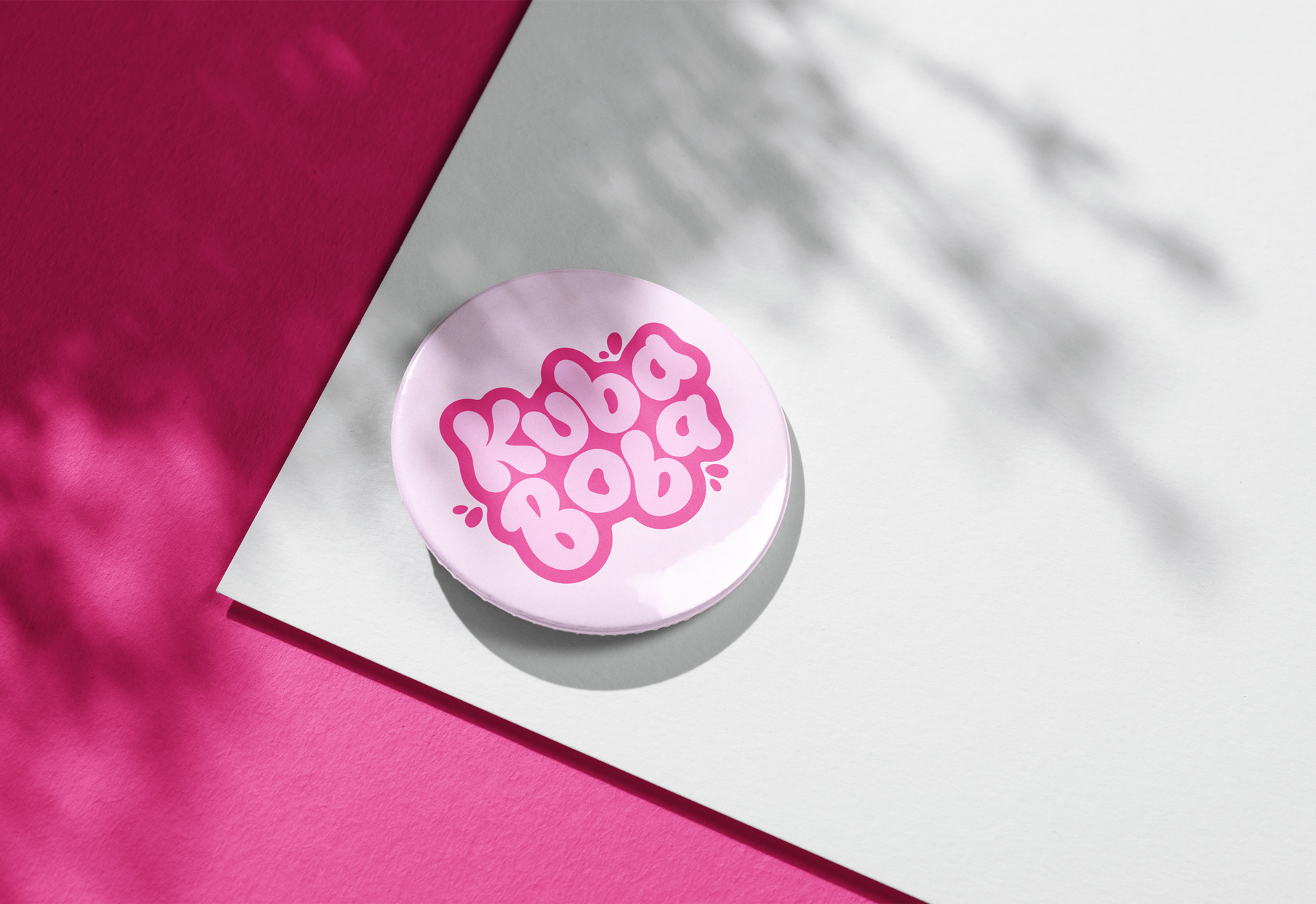
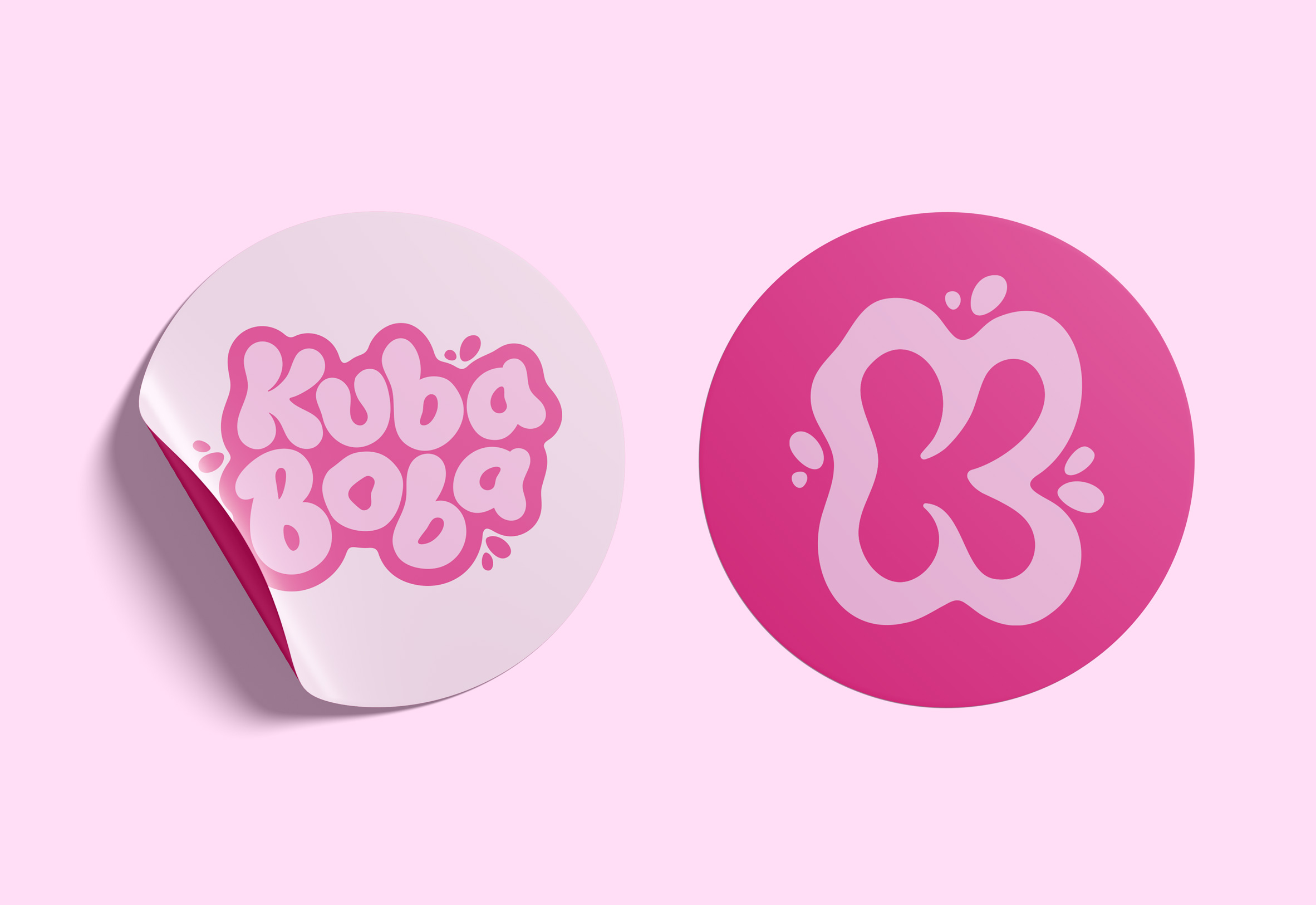
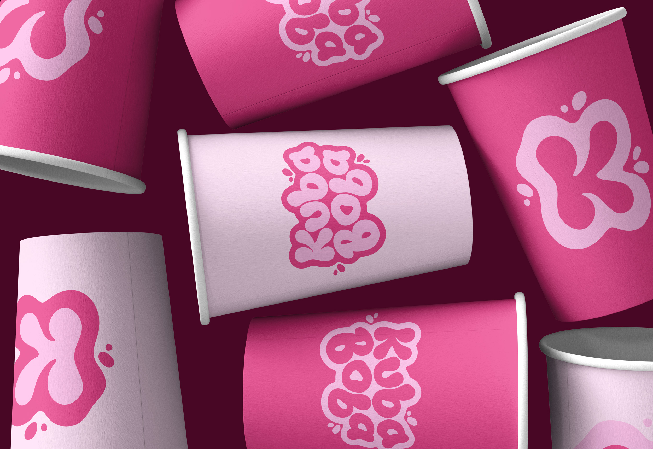
The goal of the KUBA BOBA project was to build a bold, playful brand identity that would stand out in a competitive boba market and appeal to a young, social audience. The main challenge was creating a visual system that felt both fun and premium without becoming overly childish or generic. My strategy was to combine vibrant colours, bubbly typography, and a friendly visual language that feels modern and shareable. I began with competitor research to identify what existing brands were doing, then developed mood boards to define the brand’s personality which is bright, energetic, and Instagram-friendly.
Process
The process included sketching logo concepts in Procreate, refining the final logo in Illustrator, and building a responsive logo system that works across social media, packaging, and signage. I also designed a colour palette and imagery style that highlighted the brand’s bright boba drinks and playful energy. Through this project, I learned how to balance bold visuals with readability and brand cohesion. The final result was a cohesive brand identity with a fluid, beverage-inspired logo, bold pink as the primary colour, and a responsive system that maintains recognition across every touchpoint.