Rain Text Animation

Goal
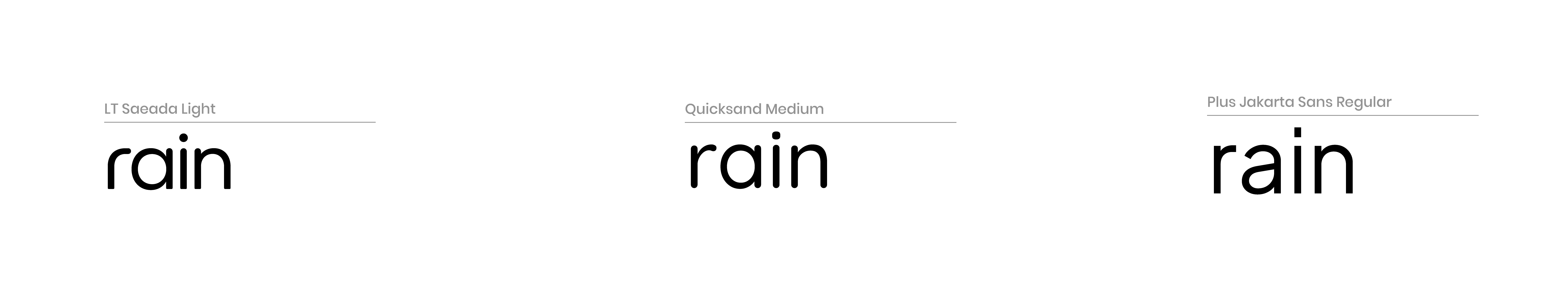
The goal of the RAIN project was to design a children’s rain boot brand identity that makes rainy days feel exciting and adventurous. The challenge was creating a design that appeals to kids while still feeling trusted and practical for parents. My strategy was to combine friendly typography, playful colour, and movement that communicates fun and durability. I began by exploring typefaces and mood boards that reflected playful, outdoor experiences and bright, cheerful weather.
Process
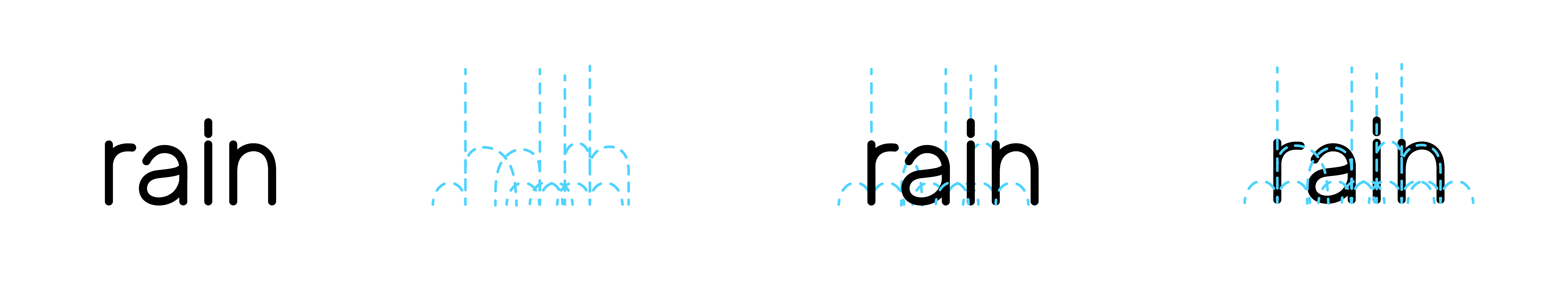
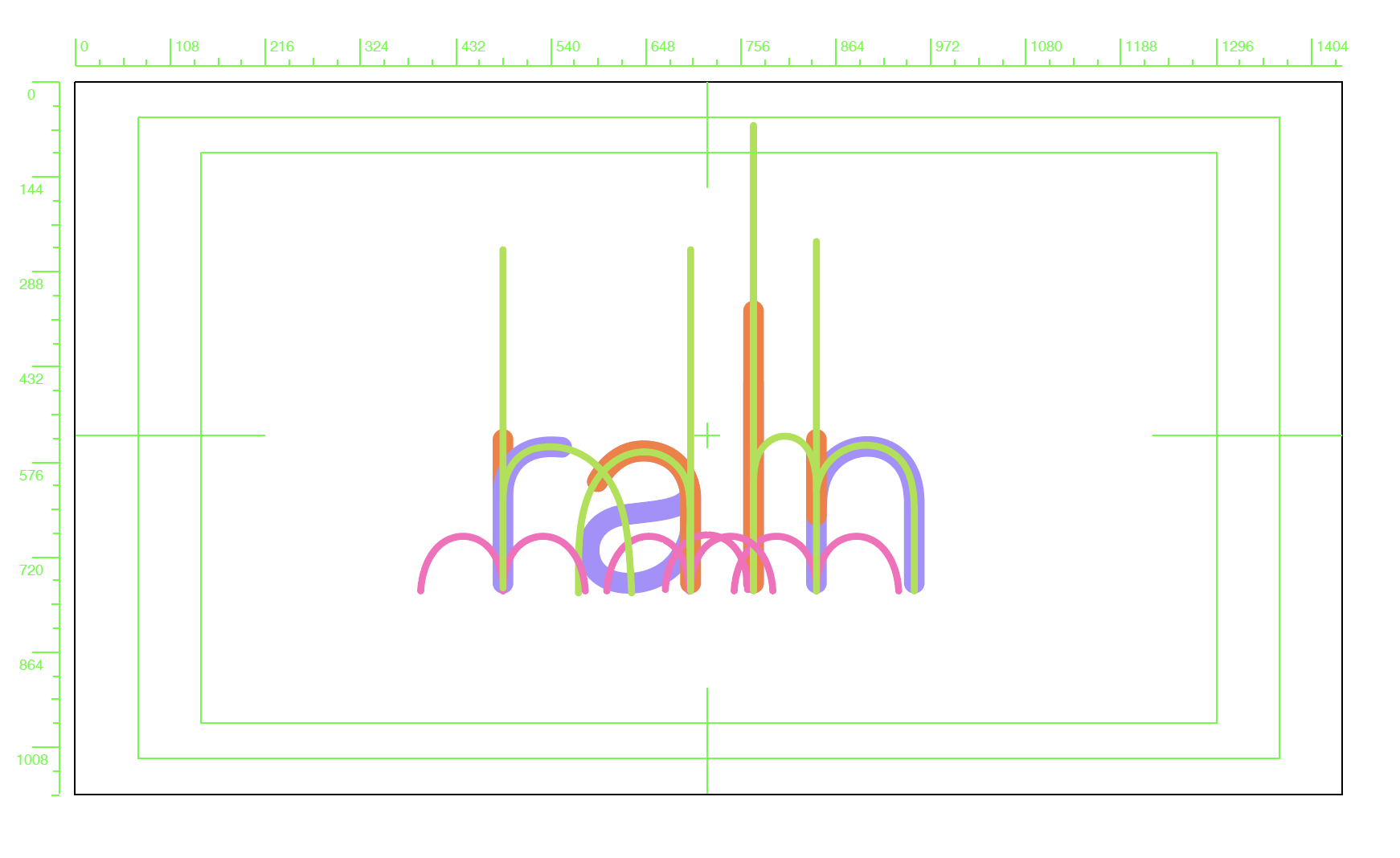
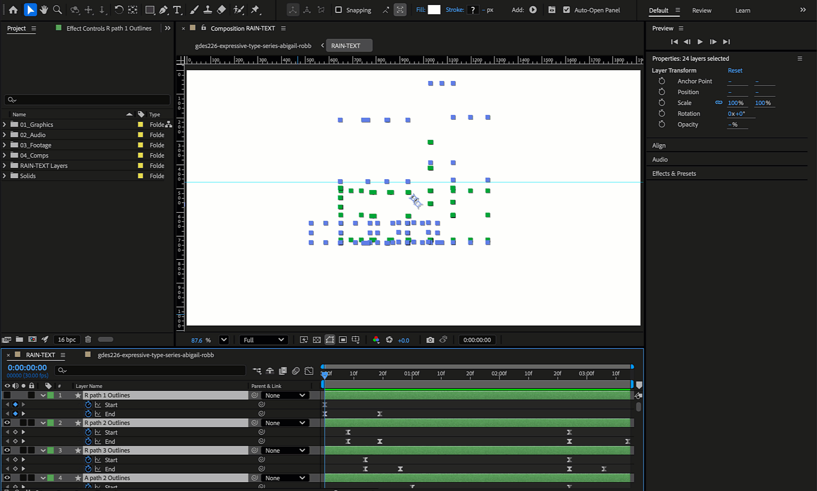
The process included sketching logo concepts, developing a long, rounded typeface to mimic falling rain, and designing a looping animation where raindrops fall and form the logo,with the letters bouncing like liquid. The final brand system included a colourful palette, playful imagery, and responsive logo usage across digital and print. The key takeaway was learning how to create a fun brand while still communicating quality and reliability. The resultis a lively, kid-friendly identity that feels playful and functional, with an animation that reinforces the brand’s adventurous spirit.